A look at the content strategy, navigation structure, load speed, mobile device preparation, and social sharebleness. Advice based on experience.
1-Minute Review of the Current Site
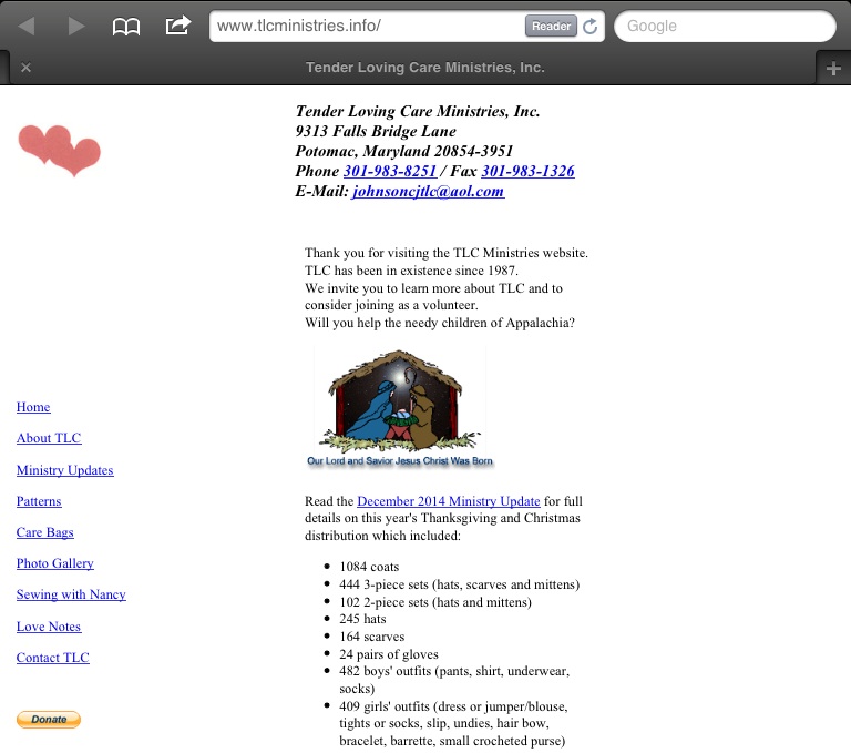
Current site, January 2015
Site shows up well in the web browser we chose for reviewing. Seems to load quite fast.
Almost no branding, minimalistic. Can be good when branding needs to breathe austerity. Is good for loading speed.
Goal of the Ministries is not stated on the home page. Learning about it requires navigating to other web pages.
Contact information is readily available. E-mail address is available for harvesting by spammers.
Information about the Christmas Distribution is helpful only if you already know about the Christmas Distribution. Is that the goal of the website?
The navigation menu on the home page sports a link to itself. Navigation menu contains terminology for insiders: "Care Bags", "Patterns". New visitors will wonder what that means and either ignore it or look into it. Which they do depends on their needs.
No social media sharing or connecting information.
No site search. Owners / managers appear to think the navigation speaks for itself.
3-Minute Review of the Current Pages
Pages show up well in the web browser we chose for reviewing. All the followed links open. Several surprises were encountered (read the page reviews below).Page: Contact TLC
Page has no H1 containing page title.Adds no contact info value beyond what is printed at the top of each web page.
Contains a Thank You text (in hyperlink blue) and a Donate action.
Page: About TLC
Page has no H1 containing page title. It does restate the organisation's name (in hyperlink blue).Adds value by stating the Ministries' goal and surmizing the founder's history.
Contains a textual call to action.
Width is limited: it is smaller than the width of the browser window we used while reviewing. Might not be optimised for use on mobile devices.
Page: Ministry Updates
Page name ("news") differs from page title ("Ministry Updates"). Page has no H1 containing page title.Contains a bare listing of links to unidentified web addresses. Those links turn out to open PDFs.
Page: Patterns
Visiting this page teaches about its purpose: listing patterns for knitting and crocheting.Patterns are listed barely. Apart from their names there is no description of what the visitor can expect. Is it a download? Is it a link to a different web site? Is it a video? An instruction? The visitor can find out only by following the links. (Hint: they are instruction web pages on the same site.)
Page: Care Bags
Surprise! This menu link does not lead to a web page. Instead it starts the download of a PDF.Page: Photo Gallery
Does not contain photos. Does contain a description with some links.The first link leads to Andrew Auten's website.
The 2nd link starts the download of a PDF.
The 3rd leads to an on-site overview with 4 photo thumbnails.
None of the links indicate where they are taking the visitor.
Page: Sewing with Nancy
Page has no H1 containing page title. Page title differs from link title.Goal of this page is clear. Description is adequate. Link description is sparse.
Page: Love Notes
Surprise! This menu link does not lead to a web page. Instead it starts the download of a PDF.Technical Analysis
According to Google Page Speed
* Speed is good.* Fonts and tapping areas are too small when displayed on smartphones.
* Links are too close together when displayed on smartphones.
* Left top of the pages contains an image, but no other valuable information.
According to Quicksprout
* Speed is good.* No technical errors of importance.
* Low count of social media sharing.
* Low amount of text on individual pages.
* Might not work well on smaller screens (smartphones).
Recommendations
Some of the recommendations below already have been addressed in the new design. It looks like a promising start. Below this list we will discuss the new design.Navigation Menu
* Avoid surprises. Mark downloads as such. (Improved in the new design.) Better yet: move them out of the navigation menu, and into a page named "How You Can Help".* Make page titles and their h1 tags the same as their link titles in the navigation menu.
* Remove the home-page link from the home-page navigation menu.
* Remove the Contact TLC page as it serves no purpose. Add its call to donate to the new How You Can Help page.
Individual Pages
* Make page titles and their h1 tags the same as their link titles in the navigation menu. Link titles are a promise of things to come. Promises should be kept.* Make sure each page serves its own purpose, and that it makes this clear to the visitors.
* Mark downloads with file type (like PDF) (improved in the new design) and size (like 160KB). Add a description so visitors will understand what they get before they follow the links. Low-bandwidth users will thank you.
* Move contact information to the bottom of the page. Instead of the contact information at the top of the page, add a big h1 tag with the title of the page. Add a logo or a smaller tag for the site identication ( "TLC Ministries"). Pressing that should lead back to the home page.
* Mark up the font sizes using points (pt) or keywords (medium, large), rather than pixels. This helps visitors using mobile devices.
* Add a viewport meta tag to help smartphone users zoom into the pages.
* Add a clear mission statement to the home page. Use simple language. Think elevator pitch: you have 10 seconds.
* Move the results of the Christmas Distribution to its own web page.
* Add a page "Who we help", describing the benificiaries of the TLC activities. Link to it in the navigation menu.
* Add another web page named "How We Help". From there, link to the Christmas Distribution. Link to this page from the home page text.
* Remove the "About TLC" page. Move the description of what it does to the new page "How We Help". Move the mission statement to the home page. Link to this page from the home page text. Move the history of the founder to its dedicated page "Our Founder".
* Add a page "How You Can Help". From there, link to the Patterns and Care Bags. Add a description of how those help, and what TLC expects visitors to do, and mention deadlines if there are any. Add the donate button to that page. Describe what TLC expects from donations, and what visitors can expect after pressing that button. Remove the links to Patterns and Care Bags from the navigation menu.
* Add a specific web page for Care Bags, that describe their purpose before forcing a PDF download onto unsuspecting visitors.
* Add photo thumbnails to the photo gallery, or at least make it clear where the links lead. (Improved in the new design.)
* Add social media connection and sharing buttons to each page. Since the amount of shares is low, showing the share counts will put people off. Omit those until the share count exceeds 100. Use static sharing buttons to minimize download size.
* Add a page that lists upcoming events. Call it "Upcoming Events". Add a link to it in the navigation menu and in the "How We Help" and "How You Can Help" pages. From there, make and link to a web page for each individual event. Add a date to the page's web address. Provide accurate and identifying details. Assume that your visitors know nothing about TLC. Then keep those event pages after the events are over, and move their links into a list of Past Events, and add the conclusions and results of each to its respective page.
Adjusting the Review and Advice Based on the New Design
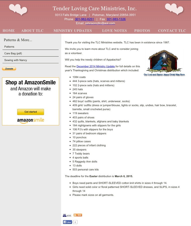
New design, February 2015
Some of the above recommendations have been addressed in the new design. It looks like a promising start. However, it introduces new problems.
* Page web addresses are spelled in upper case and contain spaces. Calling up the same pages using lower-cased web addresses results in a showing of the home page. This will confuse visitors. Please spell all page addresses in lower case and replace spaces with horizontal dashes ( - ).
* The new design employs iFrames. Some mobile devices refuse to let visitors access iFrames. Please avoid them for primary page goals.
* The new design also fails to make it apparent why there are patterns in the left-column menu. We recommend moving these away and list them into their dedicated page "How You Can Help".
* The new design shows social sharing buttons. Since the amount of shares is low, showing the share counts will put people off. Omit those until the share count exceeds 100. Use static sharing buttons to minimize download size.
* The horizontal navigation menu in the new design does not fit on the screen of smaller tablets and smartphones, forcing them to zoom out so far that links become unusable and text becomes unreadable. Apply a solution that allows menu items to flow into next rows.
* None of the pages sport H-tags (H1, H2, etc.). These are vital for search engines to understand your pages and make them better found.
Our Home Page Prototype
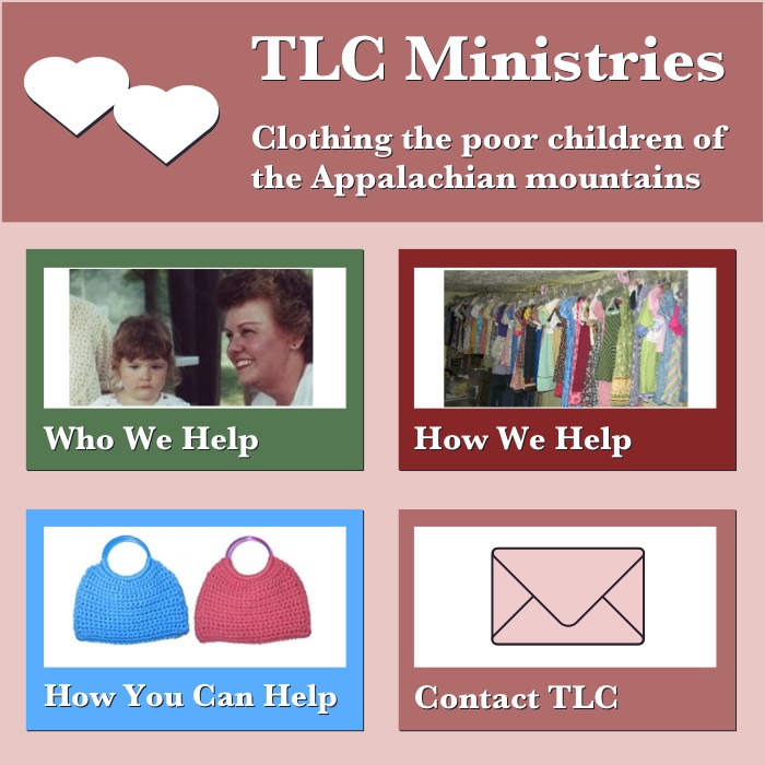
Multi-coloured Home Page, February 2015
Reducing the amount of information on the home page will draw people in. Rather than having visitors study all possible text and links, we offer only 4 (or maybe 6) choices.
The text is bold and easily readible. The mission statement is concise yet easy to understand. The pink and rose colours breathe care.
Recommendations of your own?
Please let us know in the comments below!Worried about your own website?
Describe your problem to “failurenotes at protonmail dot com”, to discuss how we can solve your website‘s issues.