Allowing a web app user to select multiple items on screen (like objects in a game or drawing app) proves harder than it seems. An exploration.
A.E.Veltstra
Sunday, October 25, 2009
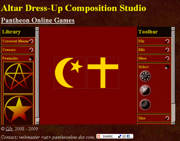
For my Canvas Composition Studio over at Pantheon Online Games, the very first of its kind on the internet, I decided to implement multi-select. I wanted to allow a user to select more than one composition items and treat them at the same time. Boy was I in for a surprise.
I chose to model the multi-select partially after the way MS Windows Explorer allows file selection. That would allow a user to grab an item and start moving it immediately, but also ctrl-click to add to or remove from the selection of items, and those two combined.

Visual of multi-select functionality
Sounds easy?
Think again. The decision tree for this should be taught at UI programming courses (and it may already be... I never got it in mine).
Not only that... try it in javascript, and find out that some web browser fires events differently from others. Choose your events wisely.
Finally, as the test in my previous post shows, for some awkward reason I incorrectly assumed that changing any html attribute apart from class, would actually cause browsers to apply different CSS styles (just like when changing class). None of them do. I checked... and as it turns out, the latest HTML 4 version (one that is not yet a recommendation) does advise exactly that behaviour.
So I had to add a class changer. Purely silly, if you ask me. However, I did manage to get it done.
Thus, functionality added or changed:
Known issues:
Next on the list: add more clip-art.
Go give it a try. Please report back any problems you find.
I chose to model the multi-select partially after the way MS Windows Explorer allows file selection. That would allow a user to grab an item and start moving it immediately, but also ctrl-click to add to or remove from the selection of items, and those two combined.

Visual of multi-select functionality
Sounds easy?
Think again. The decision tree for this should be taught at UI programming courses (and it may already be... I never got it in mine).
Not only that... try it in javascript, and find out that some web browser fires events differently from others. Choose your events wisely.
Finally, as the test in my previous post shows, for some awkward reason I incorrectly assumed that changing any html attribute apart from class, would actually cause browsers to apply different CSS styles (just like when changing class). None of them do. I checked... and as it turns out, the latest HTML 4 version (one that is not yet a recommendation) does advise exactly that behaviour.
So I had to add a class changer. Purely silly, if you ask me. However, I did manage to get it done.
Thus, functionality added or changed:
- Select all, select none, and invert selection;
- Delete now deletes all selected;
- Duplicate now duplicates all selected;
- New items are placed in a diagonal line from the top left, like windows on MS Windows;
- New items are assigned the same size on the composition as in the library view;
- Selected items can be aligned to top, right, bottom, and left;
- Selected items can be equalled in size, to equal the longest, shortest, widest, or narrowest item in the selection;
- Composition items received a new identication method that should enforce unicity;
- Exposed debugging functionality by including a messaging switch in the toolbars;
- Changed the caption of the Position toolbar to Move;
- Changed the caption of the Dimension toolbar to Size;
- Added more keyboard shortcuts and included those in the toolbar command tooltips;
- Minor tweaks to the stylesheet.
Known issues:
- Some images missing for MSIE;
- Equaling size to tallest / widest sometimes fails;
- Duplicating lots of items may use too much memory;
- No touch-screen support.
Next on the list: add more clip-art.
Go give it a try. Please report back any problems you find.
Need problem solving?
Talk to me. Let's meet for coffee or over lunch. Mail me at “omegajunior at protonmail dot com”.