Werk.NL has serious problems with its log-in, though visiting it is a required daily ritual for job seeking Dutch people.
It is impossible to log in using the Opera web browser (either mobile or desktop), and it is impossible to log in without javascript. This poses serious challenges for a large group of people.
Below we present evidence and advice.
June 18, 2014.
We have discussed Werk.NL a couple of times via various social media. Since their offer has failed to improve over the past year, we thought it time to dedicate an entire page.
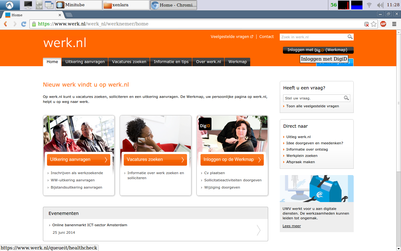
It presents itself well on most tested browsers. In the upper right-hand corner we find a black button labeled "Inloggen met DigiD". This is the log-in button, and we expect this to be the most-used call-to-action on this web page.
Unfortunately, many people will not get to see this button when they first view this home page. Why? Because the Werk.NL home page isn't responsive: it fails to accommodate itself to varying screen formats. Look what happens when we made our screen narrower:
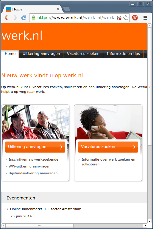
See? No log-in button. To paraphrase accessibility expert Jakob Nielsen: if the user cannot see it, it does not exist. Meaning the button may as well not be there at all.
But OK, let us assume that the visitor does frequent this web site daily, as an unemployed person in the Netherlands is instructed and required, and let us assume that the visitor has a preference for the Opera web browser, like 2% to 10% of the visitors on our own website. Then logging in all of a sudden looks like this:
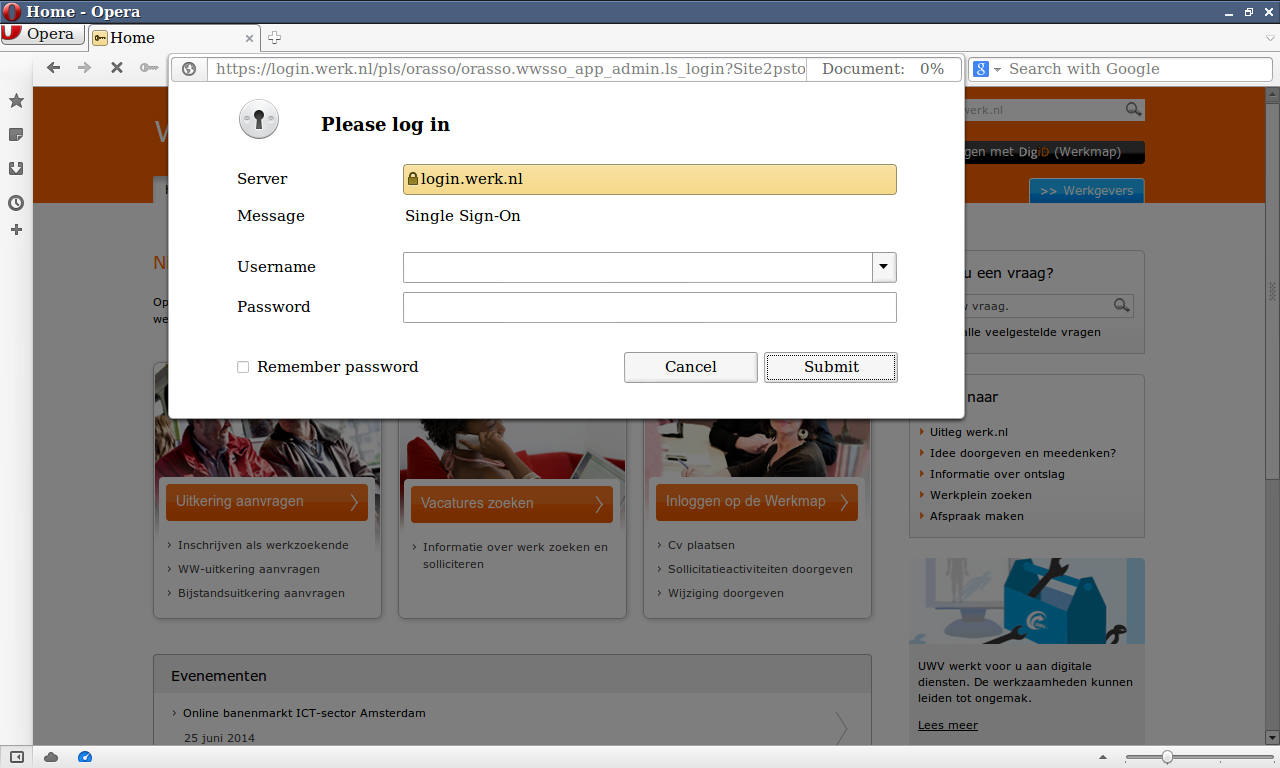
What's that? Is that an SSO (single sign-on) log-in form? It does not at all look like the expected DigiD log-in. And, worst of all, it does not work.
Why Werk.NL presents Opera users with an incorrect log-in screen baffles us completely, but at the same time does not interest us. We just expect them to offer the correct log-in.
Now, you may think, why not simply switch browsers? After all, if you have Opera installed, chances are you also have other browsers installed.
Well...
Not necessarily. Not everyone is allowed to install their own software. Some devices (like Apple's iPad) don't allow other browsers to get installed, except for proxy browsers like Opera Mini. Some devices with embedded web browsers (many game consoles like Nintendo Wii but also web TVs and smartphones) only have Opera installed and nothing else.
For users of these devices it is neigh impossible to use a different browser.
OK, so let us assume someone does have access to a different browser. For instance, Google Chrome. By default, we have disabled javascript. Then, using the same DigiD log-in button, we receive this screen:

What is that? A blank screen?
Yes.
On Werk.NL, logging in requires javascript. It fails to indicate this. A visitor just happens upon this tranquil place and startles. Now what?
Do other gouvernment websites require javascript to log in with DigiD? No, they don't. We have checked Mijn.Overheid.NL, SVB.NL, as well as UWV.NL (which, ironically, is the exact same organisation running Werk.NL), and they all allow logging in without javascript.
So why does Werk.NL refuse to let us log in without javascript? We do not know and we do not care. We just want them to fix it.
OK, so let us assume the visitor knows to turn on javascript. That brings us to the DigiD website, presenting a log-in form:
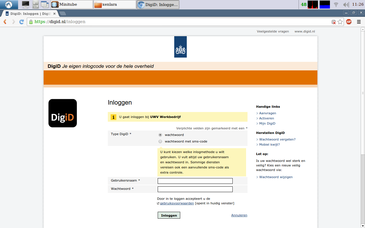
This form works perfectly well. No javascript required. It works in all tested browsers. This form, this DigiD service, cannot be the reason for Werk.NL's refusal to log in without javascript. Nor can it be the reason for Werk.NL to present Opera users the weird log-in form shown earlier.
They are required by Dutch law, and have been for quite a while. We find it baffling that Werk.NL, which is regulated by a Dutch gouvernment agency, refuses to comply to that law when it is clearly a very important tool for hundreds of thousands of visitors, who are required by the UWV to log in daily... lest they lose their unemployment.
We find it baffling that Werk.NL discriminates against users of the Opera browser. We have contacted Werk.NL and the response their representative provided was that we should use one of their computers in one of their computer centres, which are made available for that purpose specifically.
Wait, what?
Werk.NL expects an unemployed person to travel to a computer centre on a daily basis? In a country like the Netherlands, where it rains 2 days out of 3, so we cannot take the bike but have to travel by car or bus, which is quite costly? Even though said unemployed person can use a perfectly good computer and a perfectly good browser, which can access other related gouvernment websites perfectly well?
Are you going to reimburse all of your clients for their travel costs, perhaps?
No?
We didn't think so.
1. Comply to Dutch laws concerning accessible web sites and other software.
2. Comply to Dutch laws and stop discriminating based on technology.
3. Stop forcing people to spend money just because their website fails to comply to Dutch laws.
4. Be a decent organisation that cares for people rather than their own bonuses.
Now, since the OmegaJunior Consultancy has its own website development service, we are happy to offer our services and help execute above plan.
Failure Notes does not yet have a category for blatant discrimination. Maybe we should add one.
First, their Home Page

It presents itself well on most tested browsers. In the upper right-hand corner we find a black button labeled "Inloggen met DigiD". This is the log-in button, and we expect this to be the most-used call-to-action on this web page.
Unfortunately, many people will not get to see this button when they first view this home page. Why? Because the Werk.NL home page isn't responsive: it fails to accommodate itself to varying screen formats. Look what happens when we made our screen narrower:

See? No log-in button. To paraphrase accessibility expert Jakob Nielsen: if the user cannot see it, it does not exist. Meaning the button may as well not be there at all.
But OK, let us assume that the visitor does frequent this web site daily, as an unemployed person in the Netherlands is instructed and required, and let us assume that the visitor has a preference for the Opera web browser, like 2% to 10% of the visitors on our own website. Then logging in all of a sudden looks like this:
Impossible to log in using Opera

What's that? Is that an SSO (single sign-on) log-in form? It does not at all look like the expected DigiD log-in. And, worst of all, it does not work.
Why Werk.NL presents Opera users with an incorrect log-in screen baffles us completely, but at the same time does not interest us. We just expect them to offer the correct log-in.
Now, you may think, why not simply switch browsers? After all, if you have Opera installed, chances are you also have other browsers installed.
Well...
Not necessarily. Not everyone is allowed to install their own software. Some devices (like Apple's iPad) don't allow other browsers to get installed, except for proxy browsers like Opera Mini. Some devices with embedded web browsers (many game consoles like Nintendo Wii but also web TVs and smartphones) only have Opera installed and nothing else.
For users of these devices it is neigh impossible to use a different browser.
OK, so let us assume someone does have access to a different browser. For instance, Google Chrome. By default, we have disabled javascript. Then, using the same DigiD log-in button, we receive this screen:

What is that? A blank screen?
Yes.
On Werk.NL, logging in requires javascript. It fails to indicate this. A visitor just happens upon this tranquil place and startles. Now what?
Do other gouvernment websites require javascript to log in with DigiD? No, they don't. We have checked Mijn.Overheid.NL, SVB.NL, as well as UWV.NL (which, ironically, is the exact same organisation running Werk.NL), and they all allow logging in without javascript.
So why does Werk.NL refuse to let us log in without javascript? We do not know and we do not care. We just want them to fix it.
OK, so let us assume the visitor knows to turn on javascript. That brings us to the DigiD website, presenting a log-in form:

This form works perfectly well. No javascript required. It works in all tested browsers. This form, this DigiD service, cannot be the reason for Werk.NL's refusal to log in without javascript. Nor can it be the reason for Werk.NL to present Opera users the weird log-in form shown earlier.
Gouvernment websites are required to be accessible
They are required by Dutch law, and have been for quite a while. We find it baffling that Werk.NL, which is regulated by a Dutch gouvernment agency, refuses to comply to that law when it is clearly a very important tool for hundreds of thousands of visitors, who are required by the UWV to log in daily... lest they lose their unemployment.
Gouvernment websites are required not to discriminate
We find it baffling that Werk.NL discriminates against users of the Opera browser. We have contacted Werk.NL and the response their representative provided was that we should use one of their computers in one of their computer centres, which are made available for that purpose specifically.
Wait, what?
Werk.NL expects an unemployed person to travel to a computer centre on a daily basis? In a country like the Netherlands, where it rains 2 days out of 3, so we cannot take the bike but have to travel by car or bus, which is quite costly? Even though said unemployed person can use a perfectly good computer and a perfectly good browser, which can access other related gouvernment websites perfectly well?
Are you going to reimburse all of your clients for their travel costs, perhaps?
No?
We didn't think so.
What should Werk.NL do to improve?
1. Comply to Dutch laws concerning accessible web sites and other software.
2. Comply to Dutch laws and stop discriminating based on technology.
3. Stop forcing people to spend money just because their website fails to comply to Dutch laws.
4. Be a decent organisation that cares for people rather than their own bonuses.
Now, since the OmegaJunior Consultancy has its own website development service, we are happy to offer our services and help execute above plan.
Failure Notes Categorisation
Failure Notes does not yet have a category for blatant discrimination. Maybe we should add one.
Worried about your own website?
Describe your problem to “failurenotes at protonmail dot com”, to discuss how we can solve your website‘s issues.