This survey or competition over on my.opera.com requires the respondent to enable javascript. Otherwise, participation is prohibited. But why?
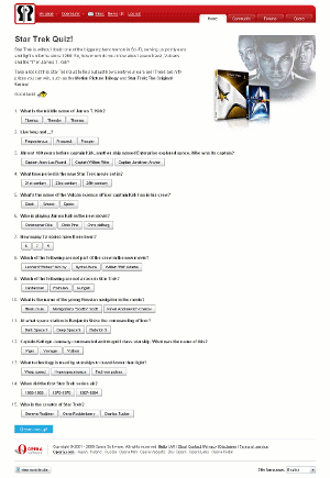
Sometimes us application developers just want to make something look better than regularly possible with the default options. In this case, the web survey developer seems to have decided that regular HTML radio buttons weren't nice enough. (Or maybe they didn't decide that themselves, but received instructions from their management.) Instead, they decided to make the radio buttons look like general push buttons.

StarTrek Survey with Javascript enabled
Zoom in 2x (88KB)
Zoom in 3x (173KB)
Radio buttons have been part of HTML for at least as long as I can remember (that's at least 15 years), and possibly longer. Texts for radio buttons can be shown using labels, which have been around equally long. Some people just don't like the way that looks. There's ways to change the looks: using CSS, using graphics, using javascript, to name a few options.
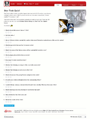
But what possible reason can someone have, to develop the radio buttons in such a way, that their texts are visible only when javascript is activated? Certainly the HTML itself doesn't require this. Neither do HTML forms, or the applications that catch and handle the form submittals.
Over a decade ago, Microsoft Visual Basic 5 allowed for a push-button look for radio buttons, at the flick of a switch. Maybe whoever designed the new look for the survey remembered that 10-year-old look, and thought it a good idea to copy.
It seems however, that they didn't realize, that their conduct forces people to enable javascript, and leaves those people in the cold, who for some reason or another can't or don't want to enable javascript. Who needs accessibility anyway? Let's make clear that knowing how to enable javascript is far from the issue. The issue is that an obstacle is introduced, which is unnecessary from a technological point of view, but imposes a problem on the user anyway.

StarTrek Survey with Javascript disabled
Zoom in 2x (67KB)
Zoom in 3x (144KB)
That makes this fall into a similar category as

"Your Money Isn't Good Enough"
Slight variation, in this case, because they aren't actually trying to sell us anything. So we'll call this category: "Your Opinion Doesn't Count".

StarTrek Survey with Javascript enabled
Zoom in 2x (88KB)
Zoom in 3x (173KB)
Radio buttons have been part of HTML for at least as long as I can remember (that's at least 15 years), and possibly longer. Texts for radio buttons can be shown using labels, which have been around equally long. Some people just don't like the way that looks. There's ways to change the looks: using CSS, using graphics, using javascript, to name a few options.
But what possible reason can someone have, to develop the radio buttons in such a way, that their texts are visible only when javascript is activated? Certainly the HTML itself doesn't require this. Neither do HTML forms, or the applications that catch and handle the form submittals.
Over a decade ago, Microsoft Visual Basic 5 allowed for a push-button look for radio buttons, at the flick of a switch. Maybe whoever designed the new look for the survey remembered that 10-year-old look, and thought it a good idea to copy.
It seems however, that they didn't realize, that their conduct forces people to enable javascript, and leaves those people in the cold, who for some reason or another can't or don't want to enable javascript. Who needs accessibility anyway? Let's make clear that knowing how to enable javascript is far from the issue. The issue is that an obstacle is introduced, which is unnecessary from a technological point of view, but imposes a problem on the user anyway.

StarTrek Survey with Javascript disabled
Zoom in 2x (67KB)
Zoom in 3x (144KB)
That makes this fall into a similar category as

"Your Money Isn't Good Enough"
Slight variation, in this case, because they aren't actually trying to sell us anything. So we'll call this category: "Your Opinion Doesn't Count".
Worried about your own website?
Describe your problem to “failurenotes at protonmail dot com”, to discuss how we can solve your website‘s issues.