How to recognise common patterns and set up new ones.
Process flow defines what steps a user (or data) and software take to achieve a goal. Thus, process flow design is part of software development, and therefore directly related to information architecture.
Common Pitfalls
1. Reinventing the wheel.
Your software application (web app, game, whatever) may seem totally unique to you, and some people even do make unique experiences.But the interaction flow through your software usually follows common patterns. If it doesn’t, users will have a hard time figuring out how to use it, and leave.
Even puzzle games have a set of interactions that are the same for every puzzle: a challenge is presented, the goal is explained, and off you go.
So trust us when we say that most process flows you will be implementing have been thought up before.
2. Refusing to follow Common Patterns
You may believe you are being innovative, and you probably are. Unfortunately, that comes at a cost: your users will have a hard time understanding what you expect from them. And unless your software application is a puzzle game, you had better adhere to common action flow patterns.This always happens when the envelope of technology is being pushed.
For instance, when a lot of internet devices became tablets and smartphones, sporting smaller screens, web designers needed to find a new way to show website menus. It took several years before the symbol for that (3 or 4 horizontal, equally long lines above each other) became recognised by the big public. For a long time, visitors would overlook the menu and would miss out on important functionality, blaming the website.
Another example was the appearance of the magnifying glass in a search term box: the big public took several years before they recognised that as the icon and the action button for the search function.
Therefore, designing on the bleeding edge is exciting, and dangerous at the same time. The danger can be mitigated using common behavioral patterns, based on well-known user experience.
3. Viewing Users as an Annoyance
Yes, users can break things. And yes, users might use your products without reading the manual. And yes, you may have to support users on a free support plan.Remember that it is the users of your product who are the ones who decide whether the product is successful, and thus, whether you turn a profit. We want to make their experience as smooth and as easy as possible.
Know your history, cultural differences, and understand human psychology.
Recognising a Pattern
Any time a certain behaviour is repeated in a similar way across websites, apps, local software, or hardware products (devices like, but not limited to: telephones, calculators, laptops, tablets, televisions, radios, fridges, washers, microwaves, cars) we can identify a pattern.Hardware Usage Patterns
With radios for instance, user experience patterns are:- pushing a button to turn the sound on or off;
- turning a dial to increase or decrease the volume;
- turning another dial to seek a radio station.
When radios became digital, the volume buttons turned digital, too, and the turn dial got replaced by 2 push buttons. A lot of people experienced a problem because of that: changing the volume now took to long. The solution for that was not, unfortunately, the return of the turn dial. Instead, the user interface designers added a 3rd button: mute.
Now we find these volume up, down, and mute buttons everywhere: on remote controls, on telephones, etc., so their use has become more common over time, as people got used to them.
Software Usage Patterns
With windowed computer operating systems (MS Windows, Apple MacOS, Ubuntu), common user action process patterns are:- expanding a menu to see more options, and select one, after which the menu closes and the selected action happens;
- moving files from one folder to another on the same hard disk usually does not result in a copy, while moving them to a different disk does;
- applications running in windows can overlap and obscure each other, can be minimised or use the full screen, and will close when their window closes.
When tablet computers appeared, multi-tasking had to be reinvented, due to the smaller screens on the tablets. Instead of dragging windows around, the user finds that each application runs full-screen, and a task bar (or a multi-finger gesture like a swipe) lets us switch between apps.
In 2010, when the iPad appeared, this change caused a shift in how people used computers. Some activities that required multiple windows open at the same time became much more difficult, to the point where tablet users felt forced to keep a laptop or desktop device nearby for “power” usage. (With the iPad in particular that was necessary anyway, as it required a full version of Apple’s iTunes for any kind of synchronisation or updating.)
Website Usage Patterns
On the web we find many, many usage patterns. So many, that it now has its own major at universities: "User Experience". It used to be part (at least in the software industry) of information architecture and software development.When the world-wide web appeared in 1991, many usage patterns got transposed from local software usage directly, and while some of those worked well, others had to be redesigned.
Internet users at that time were very aware of the fact that they were using the internet. They set up a modem connection to an ISP by dialing a phone number, they started up a web browser, and most of the available websites looked horrible and were impossible to navigate.
Many Facebook users today don’t even realise they are using the internet. Facebook is omnipresent: on smartphones, it is always on, always updating, and always full-screen.
But in those nearly 25 years (and longer, if you count the dial-up BBS period), one thing did not change: to use protected functionality, users have to log in. And in order to log in, users have to be registered. And when they lose their password, they need to reset it. And inside the service’s software a mechanism needs to exist to allow access to some functionality depending on privilege levels.
User Authentication is possibly the oldest common user experience pattern existing in software, apart from “activate, work, output, shut down”. Thus, in the next chapter we will focus on that action flow process.
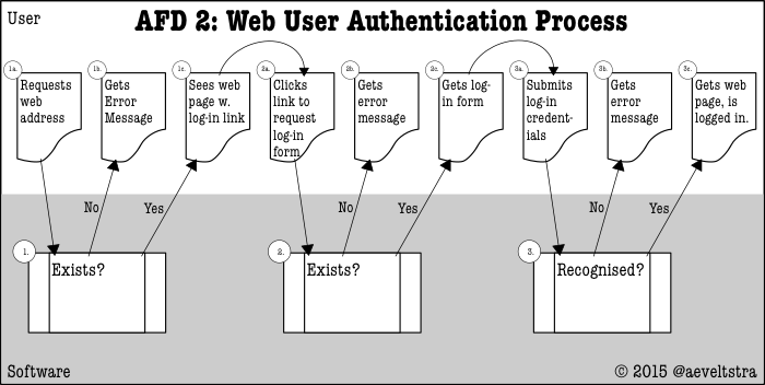
The User Authentication Process
In today’s jargon, user experience designers would call this a “User Journey”, but 15 years ago the term was “action flow process” or “activity flow process”. We used special 3-lane diagrams named “action flow diagram” that were suitable for local and client-server software, but didn’t do well in web application environments: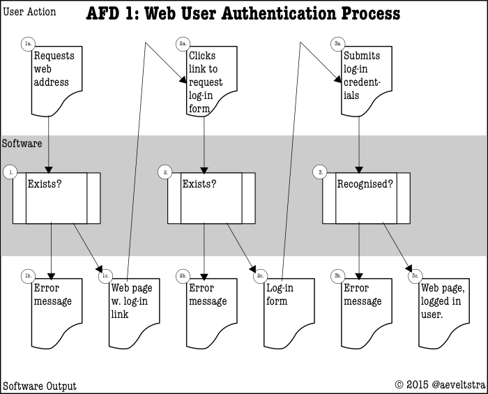
So over time the UX designers started using 2-lane diagrams that were better suited for web environments. Here at ΩJr.Net we have chosen to combine those with some pictograms we know from flowchart diagrams:
Designing Your Own Flows
Your flow has a starting point and an ending point, and any amount of separate steps in the middle. Questions to ask:- What is the goal the user wishes to achieve?
- Where do they start out when they decide to embark on their task?
- How many steps are users likely to accept, before giving up?
- Which steps do users expect from previous similar tasks?
The last question is particularly important, as we have discussed abundantly above.
Start at the End
Designing processes starts at the end: the goal, objectively measurable. Some flows have “multiple outs”: an error message can be the end of a user action flow, even though not the desired one. Make sure to identify those, and give the user a way out. Avoid luring them into a dead end.Questions to ask:
- How do we identify the goal?
- What kind of information or status do we expect at that goal?
- What kind of change should the user see at that goal?
- What information needs to be stored, changed, or shown during this step? What does that information look like? How is it formatted / structured? Does it have to be structured by you?
It is likely that some information needs to be carried from one step to the next. Therefore, it is imperative that you identify the end result.
Work your way back
Each time a decision is required or a change needs to be made by either the software or the user, your process needs another step. Step by step, identify what happens if things go as expected, and what happens if they go wrong, and how to get out of an erroneous situation. Remember that we are guiding a user who knows nothing about the programming of our application: throwing a raw error message at them is likely to raise some eyebrows.Try to force as few actions on the user as possible, but keep in mind that users already have experience with many behavioral patterns: omitting expected steps will confuse semi-experienced users.
Questions to ask:
- Does this step add any value for the user? If so: show it. If not: hide it.
- Does this step require feedback from the user, that we cannot get during a previous step, in a sensible manner? If so: show it. If not: hide it.
- What information from previous steps needs to be provided to the next?
- What new information needs to be generated during this step?
- What information needs to be stored, changed, or shown during this step? What does that information look like? How is it formatted / structured? Does it have to be structured by you?
Abstractions
When you just start drawing up a flow diagram, chances are you will want to include every detail at once, resulting in a diagram that will both be difficult to set up and read. One of the ways to prevent this is by abstracting and separating between functional and technical diagrams.For instance, in the case of web application flows, the existence of a web server using the HTTP protocol is entirely implied and therefore not shown in diagrams that show how a process fits together function-wise, whereas that same information should be present in a technical diagram. Function-describing diagrams find their place in a Functional Design, whereas technicalities-describing diagrams should live in the Technical Design.
If you look at the example user authentication diagrams above, you will notice that though there is a lane for the software, it is a single lane, rather than separated out into a tier for the application, the web server, the transport layer, the transport protocol, the data storage facility, and the hardware layer. And yet it is intricate enough to contain steps that a user normally should not see, but can see under common erroneous circumstances.
Some educational methods classify levels of abstractions as “s1” for most abstract, to “s4” for most detailed. That is OK, but don’t expect the product owner and decision maker (the person paying for the software manufacturing) to be knowledgeable about it. They will understand terminology as “least detailed” and “most detailed”.
Which level of abstraction or detail is needed in your case is a matter of good communication. Talk to the people on each side of you in the software development process: the people who give you their half-products for further development, as well as the people who take your half-products to develop more. And don’t forget to talk to the product owner: they have to be comfortable with the diagrams’ intricacy, too.
Ask Users for Feedback
How do we know whether what we designed worked well for the users? By asking them. Conducting user research is an important activity in 2 stages of the software development life-cycle: preliminary research with focus groups, and after-care research with actual users.There are several services on the internet that can help you conduct preliminary UX research. Some are turn-based (I help you if you help me), some have paid plans (you will get this many responses per month), and some are priced per feedback moment. Which is helpful to your situation depends on your needs.
The easiest way to research people's experiences is by waiting for them to contact you in case of a problem. But what to do if that never happens? Your software could work flawlessly! Yet, how could you know for sure?
Well, you could include survey requests in your service, to ask a logged-in user about their experiences. We advise to keep this limited to once a year and at an opt-in basis. Some online business specialise in tacking a user survey onto an existing website / web app, so you don’t need to develop any additional software for that yourself.
It also helps to watch your web servers’ error logs, your website's visitor analytics, and your favourite search engine’s page crawling and indexing logs. The latter is not exactly user feedback, as a web crawler is rarely human, but it is an automated user of your service and can thus provide valuable insight.
And that’s it!
Did I miss anything? I love to read your feedback, especially if I can use it to improve my articles! Please use the comments below?Need problem solving?
Talk to me. Let's meet for coffee or over lunch. Mail me at “omegajunior at protonmail dot com”.